Canyon Crest: Living Room + Half Bath

For the 
CANYON CREST LIVING ROOM
we had the task of using furniture pieces from my client's previous home.
This can be a challenge for many people.  Lucky for us, the living room was 
pretty neutral to begin with, so it was a matter of rethinking the floor plan
 and adding in pillows and accessories.

Rustic Vintage Living Room Brooke Jones Designs

The entryway into the living room had a long bare beam across the top. It was odd. Very odd.  Every time I would visit the home, I would scratch my head and think "why in the world is that beam there?" 
My solution? BARN DOORS! 
Oh how I love barn door hardware and I was excited to incorporate the look in this space.

Rustic Barn Doors Gallery Wall Canyon Crest Living Room

Yellow Blue Rustic Color Scheme Brooke Jones Designs

The half bath on the main level was SCAAARRRYYYYY when we started.  It's a small space with no windows and a high wood paneled ceiling... and it was blood bath red.  I'm not kidding.  It looks liked someone was massacred in the half bath. Instead of spending hours upon hours trying to prime and paint over the dark dark red, we decided to cover it in a light grasscloth wallpaper. This ain't your momma's grasscloth either.  It has a slight metallic sheen to it which reflects light and makes this little room shine!  Add in a little quatrefoil mirror (from this post), some rustic sconces, geometric rug and art and this blood bath of a bathroom is transformed into a jewel box!

Updated Rustic Half Bath Pottery Barn Sconce Quatrefoil Mirror Metallic Sheen Grasscloth Wallpaper

Metallic Cream Grasscloth Pottery Barn Rustic Sconce Ikea Frames

{Interior Design by Brooke Jones, Photography by Jylare Smith}

Canyon Crest: Family Room + Dining Room

I'm excited to introduce you to the CANYON CREST home!
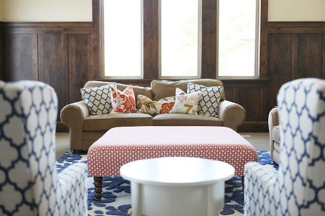
Brooke Jones Designs Canyon Crest Family Room Custom Ottoman Celerie Kemble Fabric


This home was purchased by my client a little more than a year ago and though it wasn't a total gut job, it was pretty darn close.  The first time I stepped into the family room I thought to myself  "this is where taxidermy goes to die."  Almost every member of the deer family was represented on the walls: elk, buffalo, antelope... all staring at you from two stories up. CRREEEEEPPPPYYYYY... 
(to see before shots of this space as well the custom furniture process, click here).

Vintage Rustic Family Room Built-in Toy Box Bench

 Needless to say, this home was a little more rustic than my client's personal taste. First thing we did was rip out worn shaggy carpet (can we PLEASE get over that trend?) and replaced it with a loop pile broadloom that resembled sisal (MUCH more tailored and timeless).  We repainted the faux-plastered walls in Kwal's Old Washer and restained a lot of the stain grade baseboards.  This proved to be the perfect facelift!! It did wonders. Once we had the base of the room squared away, it was just a matter of layering in a fun elements, like a rug from Anthropologie, a huge custom ottoman in a Celerie Kemble fabric, and lattice wingback chairs from Bassett Furniture.

Vintage Rustic Thomas Paul Lattice Fabric

For the kitchen and dining space, there were two existing stains: a honey tone on the knotty alder and a dark java.  Since we wanted to add as much light into this space as possible, we painted out all the dark java elements, namely, the oven range area, island, and built-in china hutch.  We replaced the dated Tuscan lighting fixtures with more contemporary glass pendants adding even more brightness to the space.

Rustic Kitchen Design Milkglass Vase Collection

Add in custom designed wingback dining chairs, farmhouse table and bright rugs and accessories, 
and you have yourself a fresh vintage rustic space!

Brooke Jones Custom Designed Wingback Dining Chair Thomas Paul

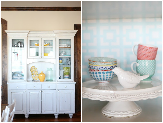
To jazz up the built-in china hutch, we also wallpapered the back of the cabinet in a pretty blue geometric print.  Having the colored background really makes the accessories pop!

Wallpapered China Cabinet
  

{Interior Design by Brooke Jones Designs, Photography by Jylare Smith}

Berkshire Estate: Basement Family Room + Kitchen

Today we're wrapping up the BERKSHIRE ESTATE with the
BASEMENT FAMILY ROOM + KITCHEN.

Brooke Jones Designs Basement Kitchen White Cabinets Floating Shelves


This area is right off the pool and hot tub and we new little wet feet would be trampling in and out to grab drinks and snack.  To prevent the flooring from getting wrecked with water damage, we used stained concrete for the floor for the kitchen/pool table area. 


How to Accessorize Floating Shelves in Kitchen

We repeated similar materials to the main kitchen, as well: 
Concrete counter tops, subway tile, industrial nickle pulls, etc.

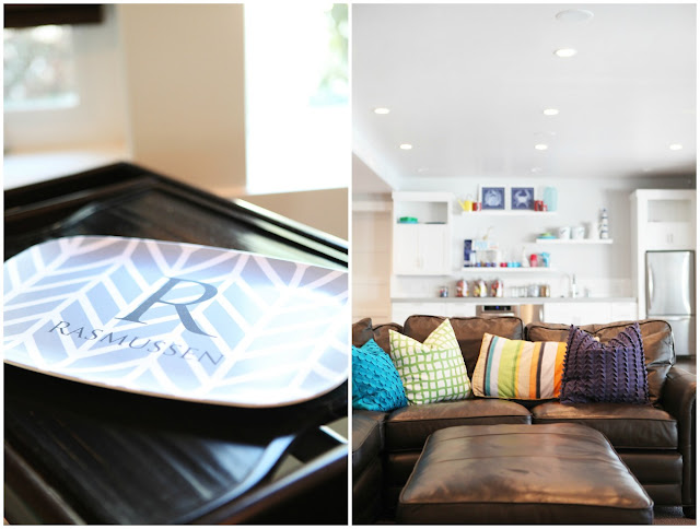
Leather Sectional Modern Basement Family Room Design

Modern Basement Family Room Personalized Monogram Tray

Modern Pool Table Industrial Light Pendant Colored Barstools

So what do you think? Is the BERKSHIRE ESTATE a place you could call home?

{Interior Design by Brooke Jones Designs, Photography by Jylare Smith}

Berkshire Estate: Bathrooms & Guest Suite

I thought I could wrap up the BERKSHIRE ESTATE in just one more post. 
Turns out, that would be one LONG post.  Today we'll cover the remaining
BATHROOMS & GUEST SUITE.

Tiffany Blue Bathroom Beveled Mirror Pendant Light Concrete Countertop

You may have noticed we are using similar materials throughout this home.  We used different versions of subway tiles, concrete counter tops with integrated sinks, pendant lights, frameless beveled mirrors, and contemporary chrome faucets to add consistency from top to bottom.

Wall mount Faucet White concrete Countertops Tiffany Blue Subway Tile

Who wouldn't want to do laundry in a tiffany blue laundry room? 
We incorporated both open and closed storage to make this utility space as functional as possible.
We used beverage buckets from Target as laundry hampers 
(I wrote about these babies here). Chic and cheap!

Tiffany Blue Laundry Room White Target Beverage Buckets Floating Shelves


Marble Mosaic Tile Grey Concrete Counter Tops Pendant Light Modern Bathroom

The hex marble mosaic tile dresses up the 12'x12' porcelain nicely, don't you think?


The guest suite is not your average guest suite.  
With picture windows overlooking the pool and hot tub and positioned off the 
2nd family room and kitchen (we'll see those tomorrow!), 
it's more like a second home within the main house.

Brooke Jones Designs Guest Bathroom

Integrated Sink Concrete Countertop Modern Guest Bathroom

Guest Bedroom West Elm Ruched Bedding Bassett West Elm Bed


Who needs a vacation when you have a get-a-way in your backyard and basement?

{Interior Design by Brooke Jones Designs, Photography by Jylare Smith}

Berkshire Estate: Family Room + Patio

Outdoor patios of yesteryear use to be the last space to be designed in a home.  Most people would buy a matching patio set (usually made of wrought iron), add an outdoor umbrella and call it good.
Today's patios are more like outdoor family spaces, with soft weather resistant fabrics,
 pillows, sofas, end tables, etc.  Take a look at the
BERKSHIRE'S FAMILY ROOM + PATIO,
and how similar the indoor/outdoor spaces are!

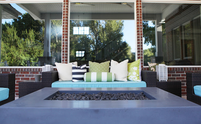
Brooke Jones Designs Modern Outdoor Patio Space Restoration Hardware Fire Pit

The fire pit was custom built by the same concrete company that made all the counter tops.  
You can also buy similar fire pits at Restoration Hardware


Weather Resistant outdoor Sofa Chair Modern Pillows

Polyester Velvet Sofa Flor Tile Stripe Basketweave Rug Coffer Ceiling


Modern Brick Fireplace Floating Shelves chunky mantel

Recognize the brick on the fireplace? It's the same brick we used on the exterior.  Using the brick was a great way to add a sense of age to the newly built space as well as consistency to the home. 

Floating Shelves Accessories Bassett Estate Chair and a Half Flor Tile Rug

We needed a  16x16 rug in the family room, so Flor tile came to our rescue again! 

Tomorrow we'll wrap up the remaining spaces, including the guest suite, 
the 2nd kitchen and family room, and a couple more bathrooms.

Whew! Almost done with the Berkshire Estate, then on to Canyon Crest!

{Interior Design by Brooke Jones Designs, Photography by Jylare Smith}
Berkshire Estate: Main Kitchen + Dining Room

I can finally show off the 
MAIN KITCHEN + DINING ROOM.

Brooke Jones Designs Kitchen Concrete Countertops Subway Tile Floating Shelves

So far I've only been able to reveal the floating shelves (as seen on Studio 5)
but there is so much more to this kitchen! I can't decide what I love most:
The stained concrete counter tops? The coffer and bead board ceiling? The sleek stainless steel hood? 
The TWO sinks and TWO dishwashers? The fridge that is the size of my first post-college apartment?
There's just too many goodies packed in this modern kitchen design!

Hidden Pantry Door Floating Shelf Porcelain Tile Stainless Steel Appliancces

The above cabinetry is actually a hidden door to the pantry. 
I wish I could take credit for that idea but that was 100% my client. So clever!
You can see the hidden opening below.


Anthropologie Bowls Mismatched Green Color Counter Stool

Having a mismatched chair isn't for everyone, I know, but I love it in this space!! 
We have so many fun pops of color throughout the floating shelves, 
it's fun to have an unexpected pop in the chairs too.

How to Accessorize Open Shelves for a Kitchen

Stainless Steel Fridge West Elm Globe Pendants Stained Concrete Countertops


X Back Dining Chairs Dandelion Wire Pendant Lights

I die over the wire dandelion pendants above the dining room table. 
We loved them so much, don't be surprised if we see the mini-version in a few bathrooms coming up.

WHAT IS YOUR FAVORITE PART 
OF THIS KITCHEN?
I'd love to hear your feedback!

Tomorrow we'll tackle the hangout spots at the Berkshire, including the main family room and deck!

{Interior Design by Brooke Jones Designs, Photography by Jylare Smith}

Berkshire Estate: Kid Spaces

I am a big believer in designing kid spaces for the future, not just for today.
Kids grow up, so if a space is designed around an age specific theme 
(i.e. Winnie the Pooh, Super Man...) then you have placed an expiration date on the space. 
Someday the kid will outgrown the theme and you will have some redecorating on your hands.


If you design kids spaces that are YOUTHFUL instead of YOUNG, 
then the space will grow with your child.

Great examples of this concept are the 
BERKSHIRE'S KID SPACES.


Though the boys of the house love Toy Story and Cars, 
we designed their rooms around basic stripes and industrial finishes, like gunmetal and chrome.
The 'young'-ness comes in through their toys and easily replaced items, like shower curtain hooks.


Blue White Awning Stripe Bedding Green Monogram Canvas Ceiling Fan Custom Nightstand Low Profile Bed

Do you recognize the nightstands (or at least the corner of the nightstands)?
They were actually the master bedroom's nightstands that were made to the wrong measurements. 
With the addition of a low profile gunmetal bed, though,
we were able to save these gorgeous pieces from the recycle pile!

Kid Desk Space Stained Concrete Counter Top Grey Cabinetry White X Back Chair

The kid's desk area is open to the main kitchen (which I'll be revealing in all it's glory tomorrow) so we repeated the island's materials.  We painted the desk a charcoal grey, added stainless steal pulls, installed stained concrete counter tops and hung three globe pendants in row.

West Elm Globe Pendants Kid Work Space Concrete Counter

Now for the envy of every kid in the neighborhood:
THE BALL PIT AND SLIDE.
(the concept of keeping kids spaces timeless kind of went out the window with this one...
But come on, it's a BALL PIT with a SLIDE!)

Ball Pit Under Stairs Yellow Banana Slide

In Home Ball Pit With Slide Space Under Stairs

 Such a cool idea to use up the awkward space under the stairs.
Chucky Cheese who?

{Interior Design by Brooke Jones Designs, Photography by Jylare Smith}